
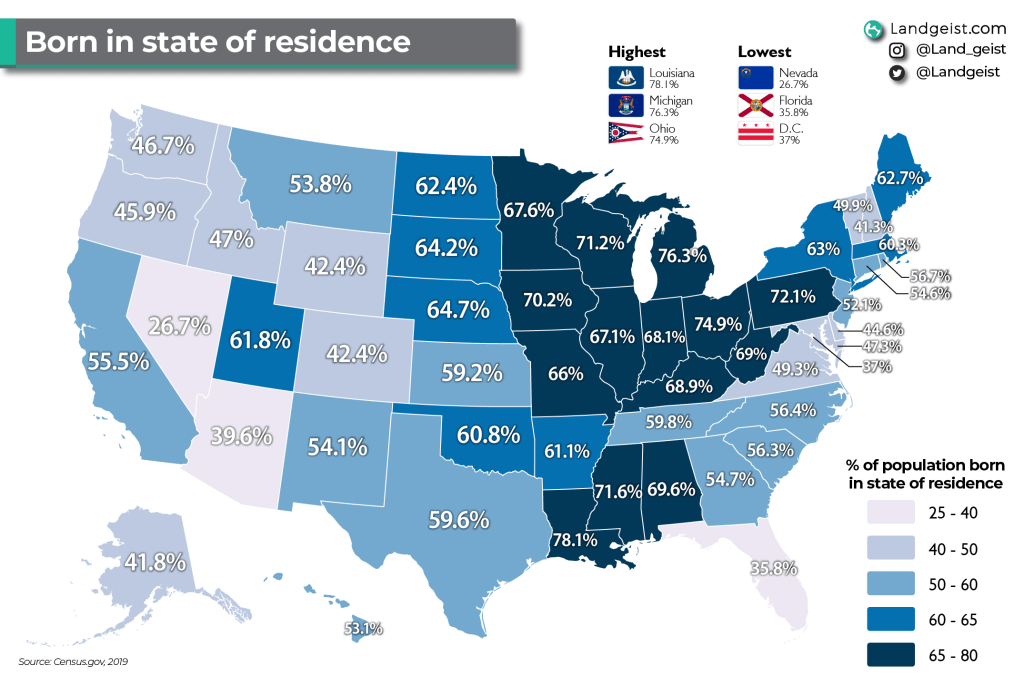
What percentage of each state’s population was born in that state.

Like this map and want to support Landgeist? The best way to support Landgeist, is by sharing this map. When you share this map, make sure that you credit Landgeist and link to the source article. If you share it on Instagram, just tag @Land_geist. On X / Twitter tag @Landgeist.
Here we can see what share of each state’s population was born in that state. The data includes all residents, including foreign born residents.
We can immediately see a very strong geographic pattern. The Mid-West and part of the Deep South is where the highest percentage of people were born in the state of residence. Louisiana has the highest share, where 78.1% of its population was born in Louisiana. Michigan (76.3%) and Ohio (74.9%) are just behind Louisiana.
The lower percentages can be found further West, in Florida and parts of the East of the US. Nevada has by far the lowest share, where only 26.7% of its population was actually born in Nevada. Florida (35.8%), D.C. (37%) and Arizona (39.6%) are the only other states where less than 40% of its residents were born in that state.


Leave a comment