
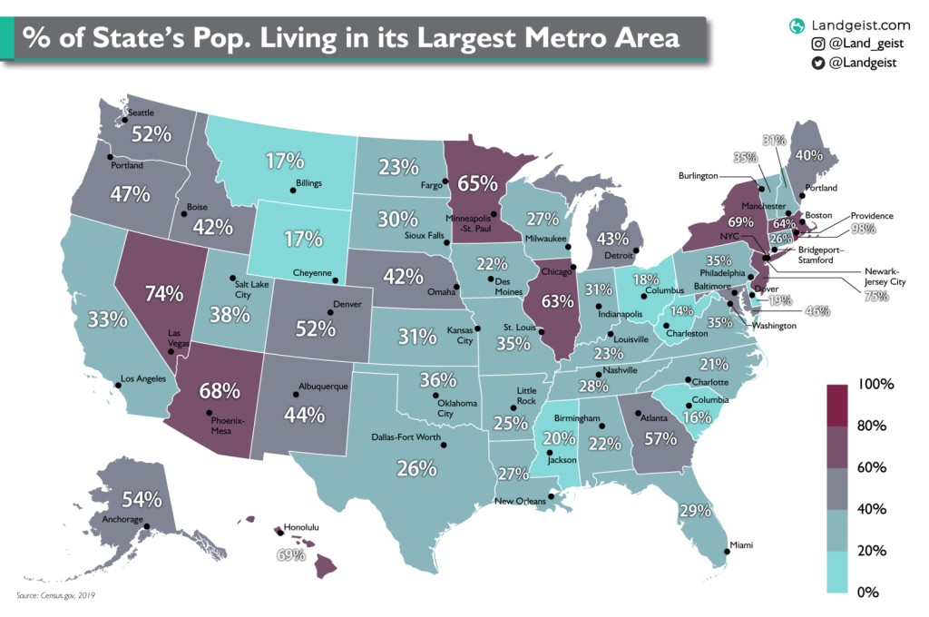
This map shows how much the population of each state is concentrated in its largest metropolitan area.

Like this map and want to support Landgeist? The best way to support Landgeist, is by sharing this map. When you share this map, make sure that you credit Landgeist and link to the source article. If you share it on Instagram, just tag @Land_geist. On X / Twitter tag @Landgeist.
The state with the highest percentage living in its metropolitan area, is Rhode Island (98%). This is because the metropolitan area of Providence covers all but one municipality.
This map gives an interesting look at how much of a state’s population is concentrated around its largest city. In states like Nevada, Arizona, Illinois and New York, the vast majority is concentrated around one city. Whereas in some other states, even with a high population, it’s more evenly spread out over multiple cities and areas, like Texas, Ohio and Florida.
For metropolitan areas that cross state borders (like the New York-Newark-Jersey City metropolitan area), only the population living in that specific state is counted. So for New York state, only the population that lives in the New York state part of the New York-Newark-Jersey City metropolitan area is included in the calculation.
The population data is from 2019 and is gathered from census.gov.


Leave a comment