
What percentage of 25 to 29 year-olds in Europe live with their parents?

Like this map and want to support Landgeist? The best way to support Landgeist, is by sharing this map. When you share this map, make sure that you credit Landgeist and link to the source article. If you share it on Instagram, just tag @Land_geist. On X / Twitter tag @Landgeist.
Until what age young adults live with their parents can depend on a lot of factors. Culture, housing, the economy and religion can all play an important role in that. For this map, we can straight away see that there is a very strong geographical pattern for this subject.
The differences in numbers are enormous in Europe. While only a very tiny percentage of Danes between the ages of 25 and 29 live with their parents, the vast majority of people in the same age group in the Balkans live with their parents.
The Scandinavian countries (except Iceland) have the lowest percentage of anywhere in Europe. The vast majority of Scandinavians between 25 and 29 don’t live with their parents. In Western Europe, the percentage is also relatively low. Ranging from 16% in the Netherlands to 52% in Ireland.
As we start looking at south and eastern Europe, we can see that the percentages are mostly over 50%. The highest percentages can be found in the Balkans. In most of the Balkan countries, 70% of young adults live with their parents. The number is the highest in Croatia, where 80% of young adults live with their parents.
In the US for comparison, it’s about 16.7% (25-34 year-olds). I was hoping to make a similar map for Asia, but haven’t been able to find any data. If you do happen to come across any data, shoot me a message or leave a comment below.
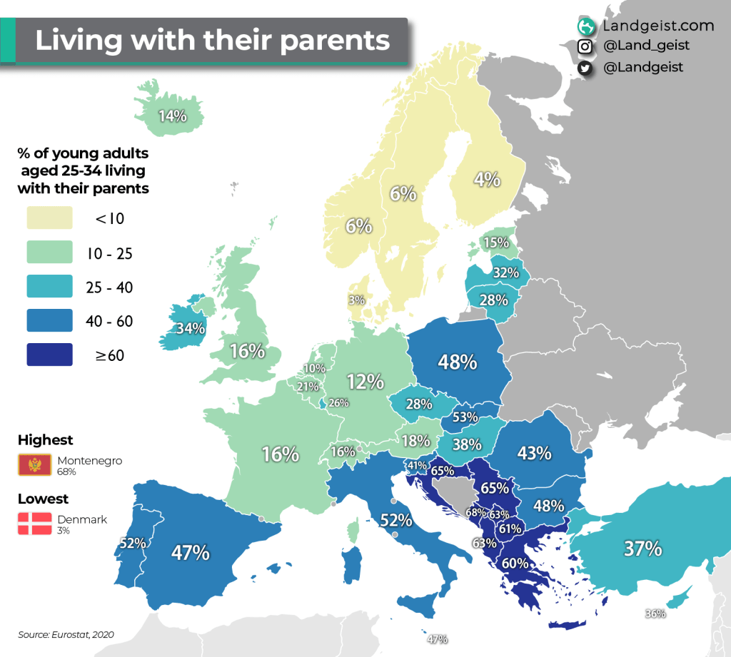
The data for this map comes from Eurostat. The data also includes people that live with only one parent. For this dataset, I thought it would be most interesting to look at the oldest age group of young adults. The source data contains numbers for the ages of 16 to 34. However, there is no data for specifically the 30 to 34 group, only 25 to 34. Which I think is too broad of an age group. Especially because there often is quite a bit of a difference between people in their late twenties and early thirties when it comes to job stability and income.
The data comes from a survey and is collected through interviews. So, the data is not based on where people are officially registered. In some countries, young people sometimes stay registered at their parent’s place. While in reality, they live elsewhere to study. This could skew the data for some countries. Fortunately, this dataset is based on where people actually live, instead of where they’re registered.
The inspiration for this map comes from a viral map that has been floating around the internet for quite some time now. The data for that ‘map is quite old by now. If I remember it correctly, it’s from 2013/2014. So that’s almost 10 years old by now. It shows the data for the 25 to 34 year-olds. As explained earlier, I personally think that’s too broad of an age-group for this subject. One other thing is the colour scheme of that map. It uses a diverging green-red colour scheme. One should only use a diverging colour scheme if there’s a clear point in the middle (mostly 0). This is often the case for maps about population change (increase and decrease). On top of that, a green-red colour scheme is not colour blind friendly. Although I have used that colour scheme in the early days of Landgeist, I’ve completely abandoned it now and try to make all my maps colour blind friendly.
For those of you that are curious about the numbers for 25-34 year-olds, I’ve made a map for that age group as well.

As you can see, there is a slight difference. For north and western Europe, not much changes compared to the 25 to 29 year-olds. For southern Europe, the numbers drop quite a bit. The same goes for eastern European countries like Slovakia and Hungary. For the Balkans, the numbers drop, but they are still clearly the highest in Europe. Please be aware that I used different data classes for both maps. They were not made to compare with each other. So if you do want to compare these two maps with each other, pay very close attention to the numbers, not the colours.


Leave a comment