
The Olympic games have come to an end. The United States are at the top of the medal board with the most gold medals and also the most medals. But how does each country’s performance look like when you compare the number of medals to its population size?
Like this map and want to support Landgeist? The best way to support Landgeist, is by sharing this map. When you share this map, make sure that you credit Landgeist and link to the source article. If you share it on Instagram, just tag @Land_geist. On X / Twitter tag @Landgeist.
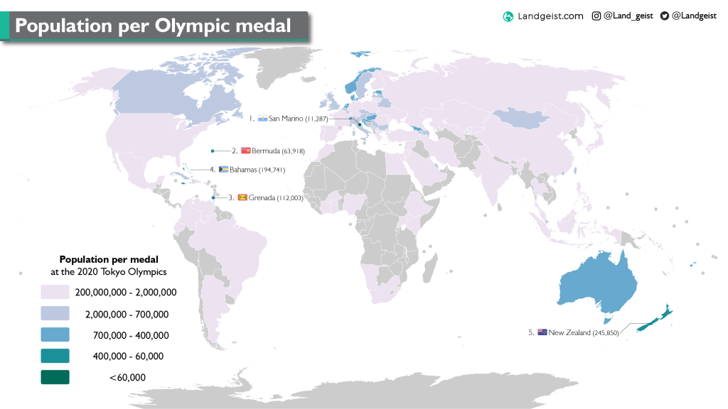
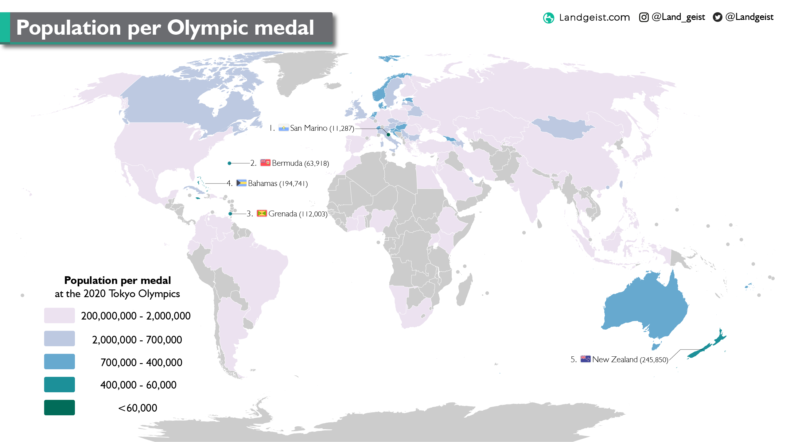
When we compare the population to the number of medals a country has won, we look at the population per medal. The smaller the population per medal, the better. When using this metric, we can see that quite a few of the top 10 countries, end up in the lowest class of this map. China, France, Germany, Japan, Russia and the United States all have more than 2 million people per medal. China would be lowest of the top 10, with almost 16 million people per medal.
The best performing country in the top 10 would be the Netherlands, with 481,000 people per medal. The Netherlands won 10 gold medals and 36 medals in total in Tokyo.
The country with the smallest number of people per medal, is San Marino. With only 11,287 people per medal. The European micro-state with a population of 33,860 won one silver medal and 2 bronze medals in Tokyo. Second is Bermuda, which won one gold medal. Third is Grenada, which won one bronze medal. Fourth is the Bahamas with a population of 389,482. They won 2 gold medals. Fifth is the first country with a population over 1 million. New Zealand won 7 gold medals and 20 medals in total. This results in 245,850 people per medal.


Leave a comment